Compound selection. Description of dashboard uses.
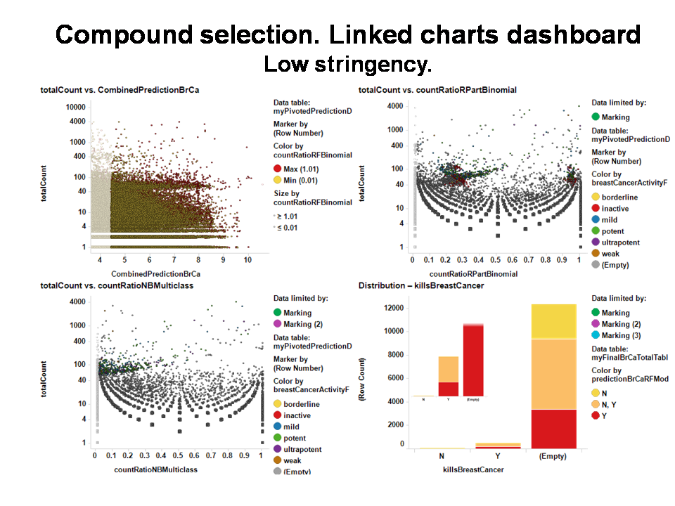
Let’s look at a typical multimethod compound selection dashboard. It is a panel where predictions through different models are interactively compared to allow quality control of the selection. As most compounds include multiple experimental events recorded in the database, and there is a prediction for each event, we need to calculate an index of activity for each compound. For regressions, this is the average BrCa score (CombinedPredictionBrCa), while classification will use the ratio between the number of times a compound has been predicted active vs the total number of events (countRatio).
click on the chart to expand
Top left plot: Average BrCa score from random forest regression vs total number of events.
Top right plot: countRatio from decision tree prediction vs total number of events.
bottom left plot: countRatio from Naive Bayes prediction vs total number of events.
bottom right plot: QC barchart. Displays the selected compounds, using the existing information from those labelled as active or inactive (those used in the validation process) to monitor the quality of prediction. Colors are used to compare RF regression based prediction to RF classification output. Inset is a magnified chart to better appreciate the RF classification output for the compounds that have an experimental label of BrCa activity.
The above dashboard is an example of a low stringency selection method. The selection of all compounds with a combined prediction score > 4.5 in the top left plot, independent of the number of events they have participated in, activates the top right (decision tree prediction) and the bottom left (Naive Bayes prediction) charts. Further selection of compounds that have resulted active in any occasion from these plots, is depicted in the bottom right chart, where RF regression and classification are compared for the selected compounds.
click on the chart to expand
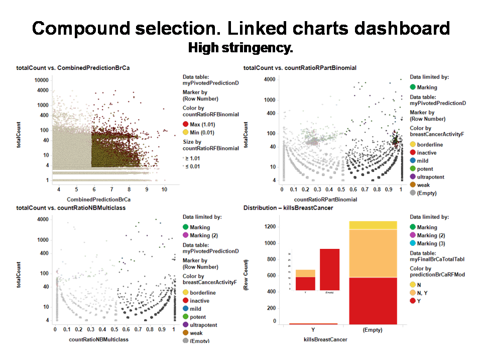
The dashboard on the right selects a smaller number of compounds by requiring an RF regression predicted value of >6 on more than 3 occasions, and >50% active predictions vs total in the other classification algorithms. It yields about 1200 compounds, 10 fold less than using the low stringency method, but QC charts (bottom right) show much better concordance metrics.
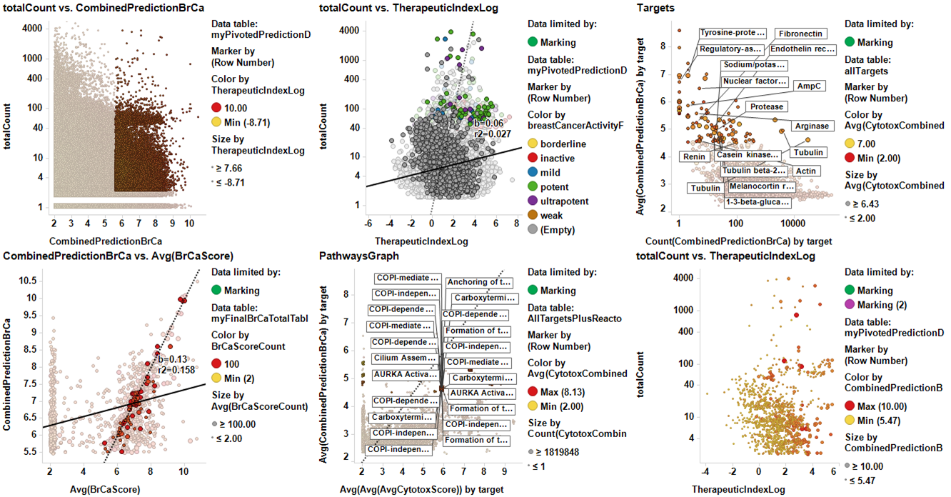
Dashboards can be as complex as wanted. The dashboards below include cytotoxicity, targets, and even pathways in the decision process. Here, is enclosed a dashboard with cytotoxicity prediction and a calculated therapeutic index based on the difference of the BrCa Score and the cytotoxicity score (log difference).
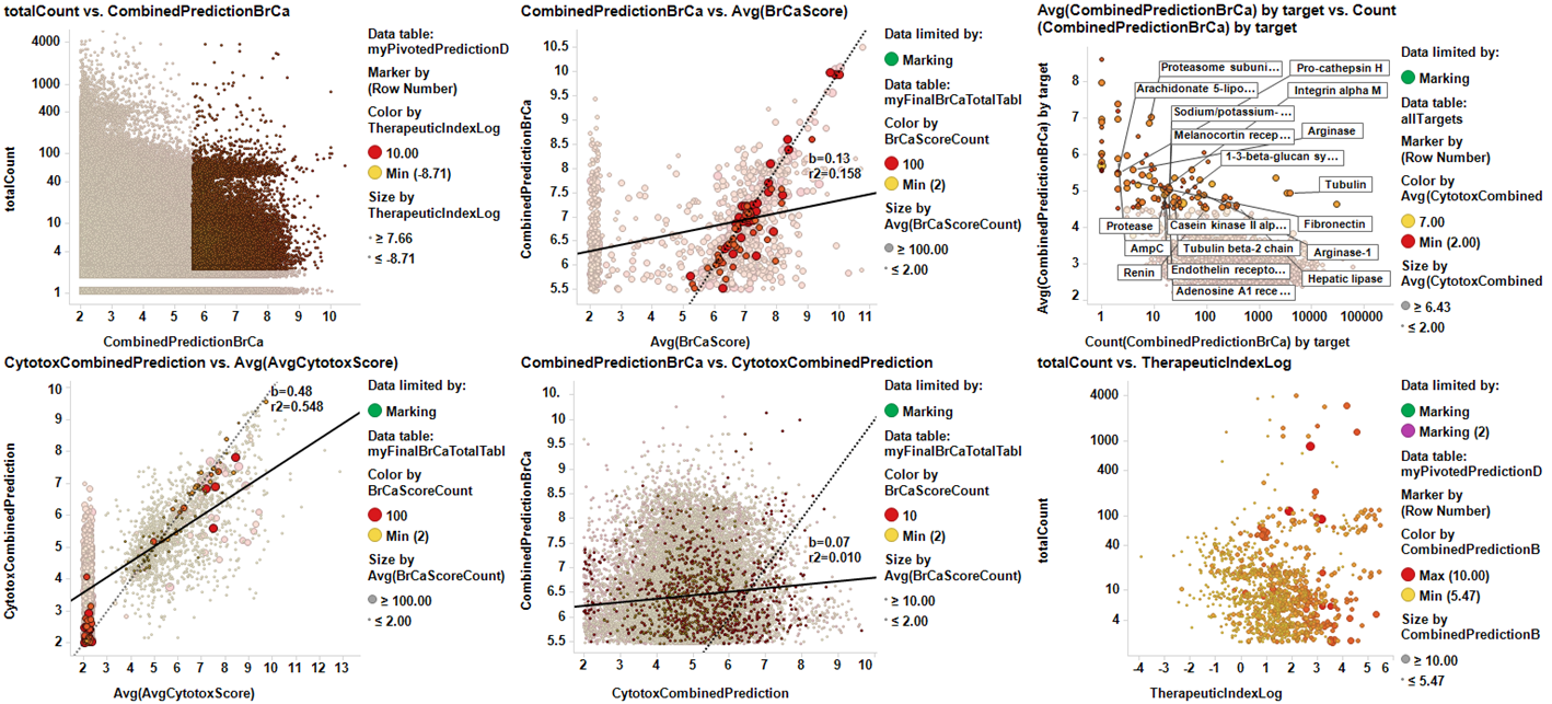
In this dashboard, targets with the highest predicted score for BrCa depicted in the top right plot, are highlighted in the central bottom graph that displays cytotox score vs BrCa score, both calculated per target. The selection is displayed in the bottom right plot, that represents the therapeutic index of compounds acting in the marked targets vs the number of event recorded in the DB. This sort of dashboards allow the control of additional properties as cytotoxicity, at different levels (target) simultaneously to compound selection.
link to selected compounds and some structures