Here, we will focus on a network module encompassing pathways involved in
cell cycle control, apoptosis and protein degradation processes.
Modularity methods can be reviewed in the SARS CoV pathways analysis section in this web site.
First, we can have a look at the pathway/gene network graph. We can identify as key players Ub-ligases, P53 and its modulators, cyclin-dependent kinases, RUNX3 and NF-kB.
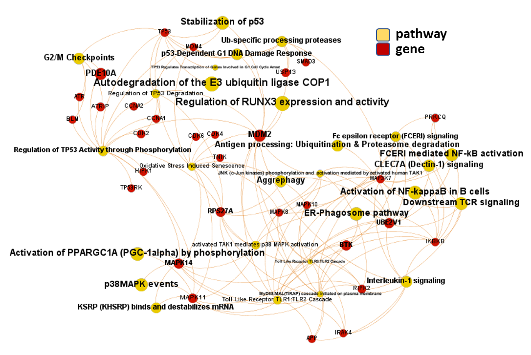
Gene-pathways association map for this module. Node size by predicted activity against coronavirus aggregated at the node level.
Next, observe how pathways in this module score in this aggregation scatter plot.
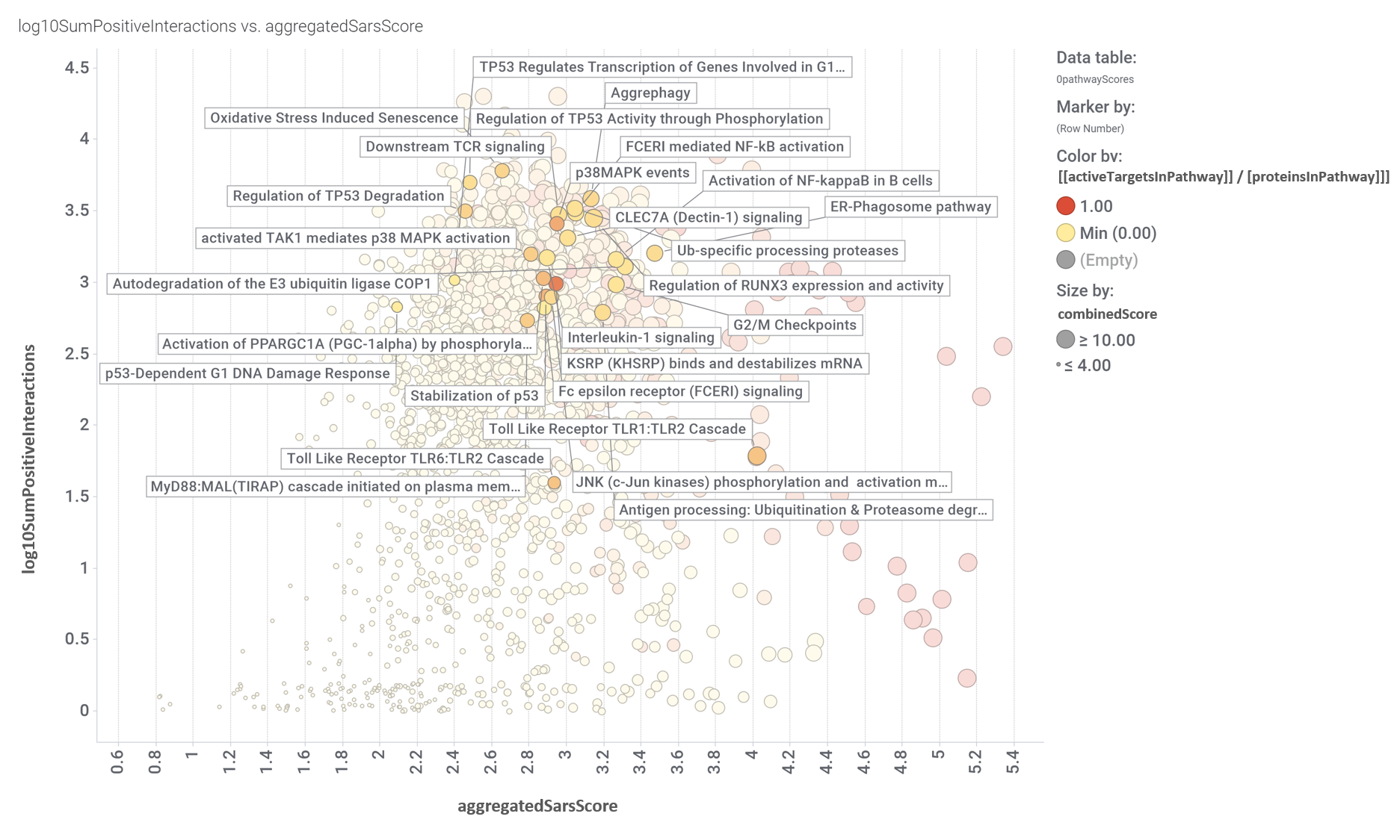
Pathways scores for coronavirus obtained from aggregation of the target/pathways association map values. Log10SumPositiveInteractions.- Logged addition of all active interactions of predicted SARS active molecules with all the proteins belonging each pathway. AggregatedSarsScore.- Average value of predicted activity against SARS viruses aggregated at the pathway level from the values assigned to each protein/gene. [[activeTargetsInPathway]] / [proteinsInPathway]]].- Number of proteins considered relevant for SARS coronavirus infection in a particular pathway vs the total number of protein of that pathway referred in the ChEMBL DB. CombinedScore.- Linear combination of the number of evidences supporting a score (log10SumPositiveInteractions) and the predicted score from aggregation for a pathway (aggregatedSarsScore).
And how pathways in this module score in the volcano enrichment plot.
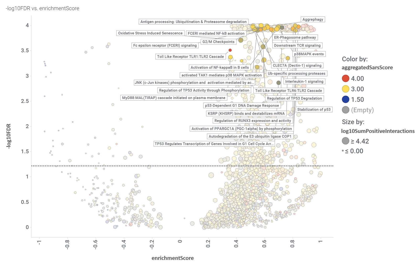
Volcano plot displaying the relationship between enrichmentScore and negative value of the flagged false discovery rate (-log10FDR). Size and colors by the aggregation scores described for the aggregation chart. Dotted line marks the 0.05 pValue threshold. Pathways in this module flagged.
Aggregation and enrichment scores are ranked in the bar chart below.
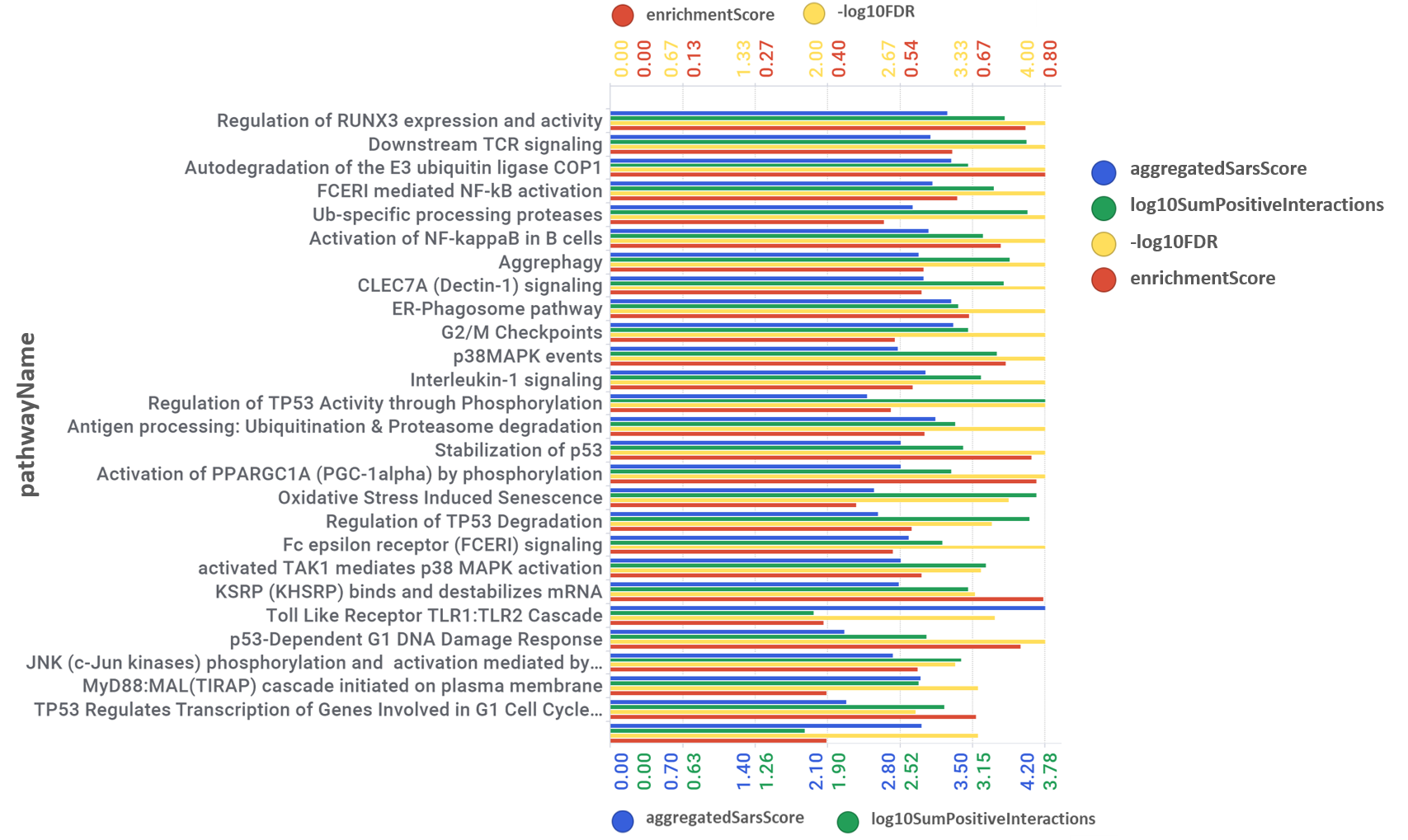
Best scored pathways bar chart. Pathways ranked by its overall combination of scores.
We can also visualize GSEA Enrichment plots for some representative pathways.
For full reference, see “Gene set enrichment analysis: A knowledge-based approach for interpreting genome-wide expression profiles.” and “ReactomePA: an R/Bioconductor package for reactome pathway analysis and visualization.“.
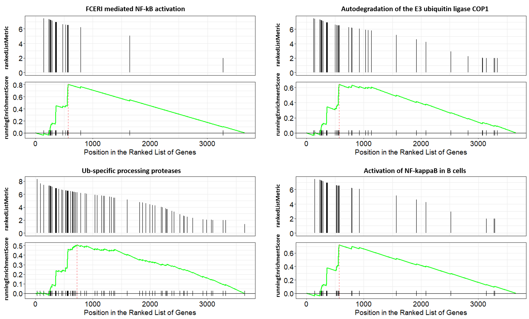
GSEA enrichment plots for four representative pathways in this module.
By using Reactome pathways hierarchies, we can identify additional biological roles to be played with associations of pathways in this module with same and higher level pathways.
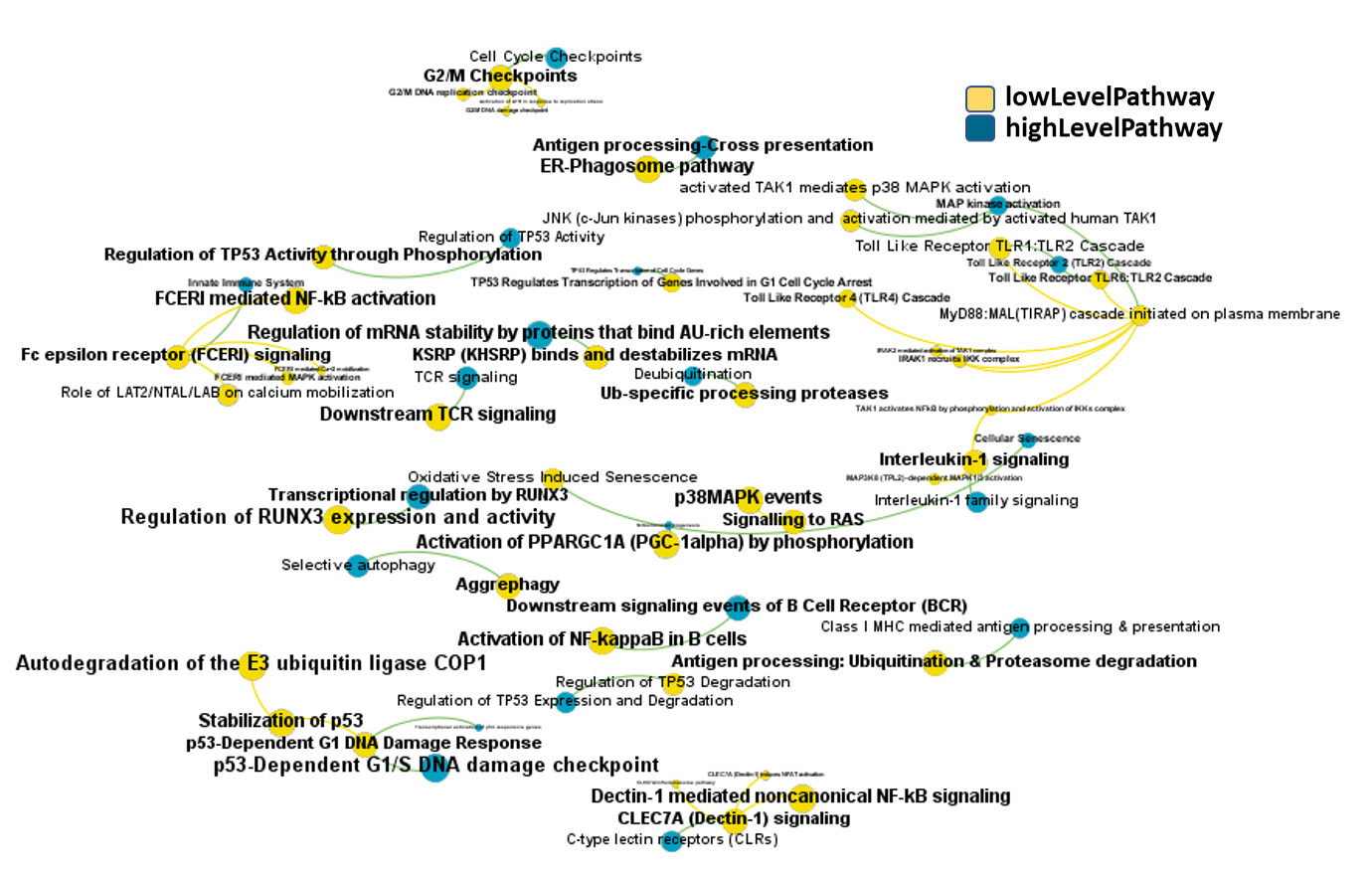
high-low level pathways associations graph set by pathways in this module. Reactome low level pathways. Node size by predicted activity against coronavirus aggregated at the pathway level.
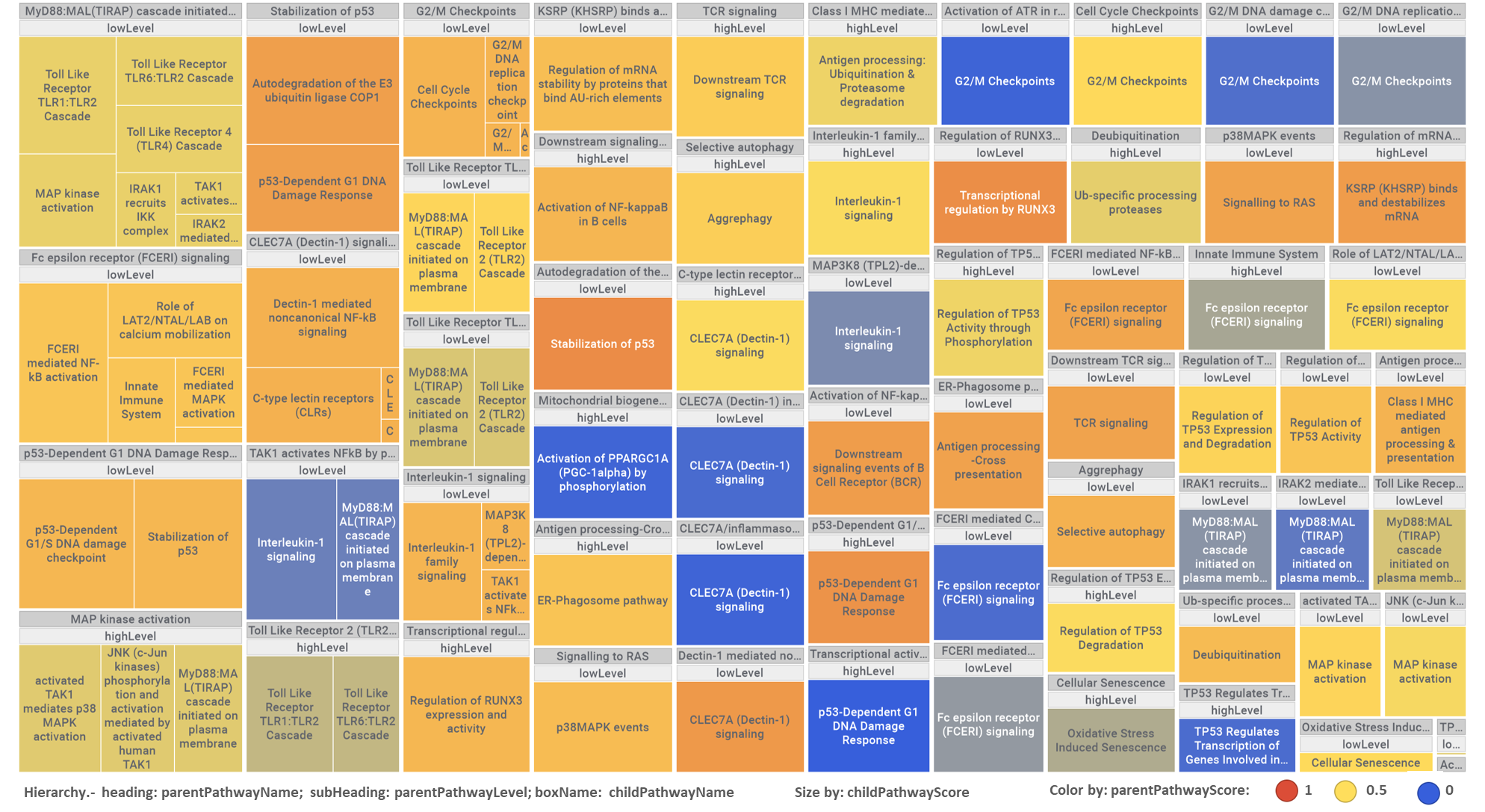
This hierarchical association with different level pathways can also be visualized in a tree map, where parent pathways in headings embrace their child partners, sized and colored by their respective scores as described in the legend.